Prisms.
 
Back

Aevum: Brand Identity for a Multi-Family Office That Manages by the Generation

As first-generation wealth moves into its second and third generation, families are finding that private banks are built for products and quarters, not succession. Aevum set out to become a multi-family office organised around continuity instead. The project aimed to give the category a brand that reads as a custodian, not a distributor.
Year2026
ClientAevum
The Aevum logotype in white over a molten orange gradient

Problem

Multi-family offices sit in an awkward middle. Firms that look institutional enough to be trusted with nine figures read like the private banks these families deliberately left, and firms that feel personal enough to be a family's counsel read too small to hold the mandate. Aevum needed an identity that carried institutional weight without institutional distance.
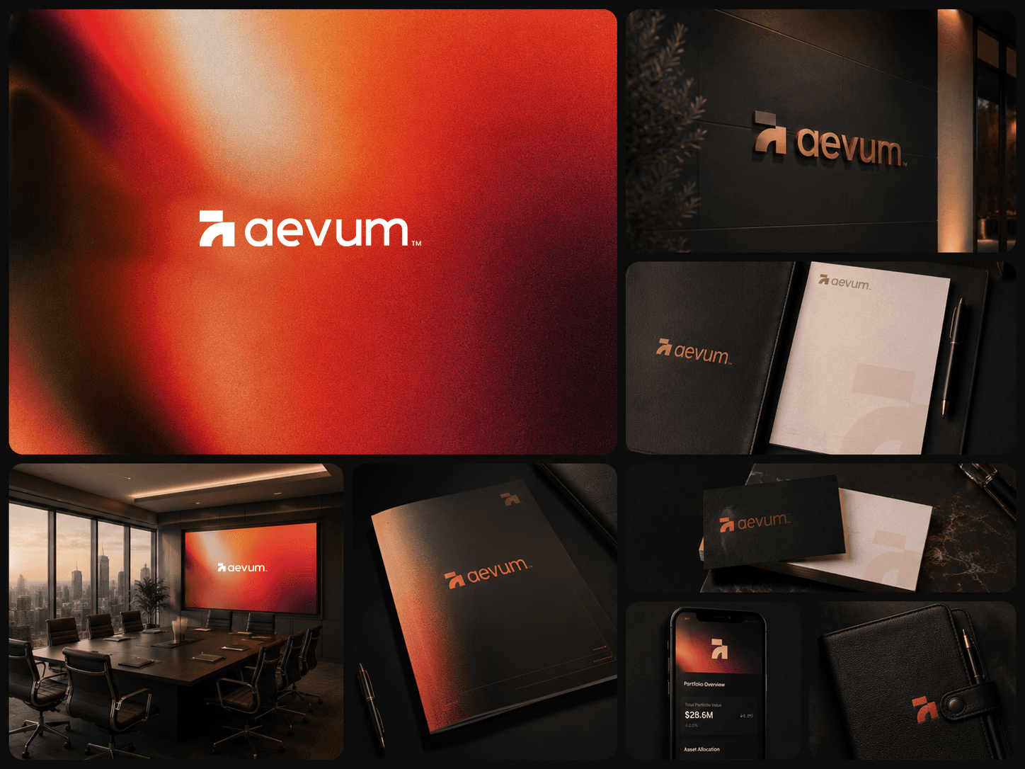
The Aevum identity applied across signage, stationery, report covers, a boardroom screen and the client app
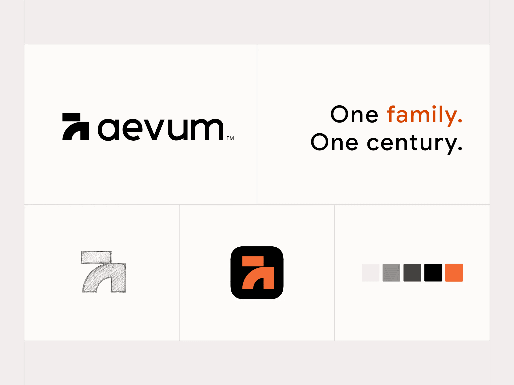
Aevum brand system sheet — logotype, the line “One family. One century.”, the original mark sketch, app icon and colour palette
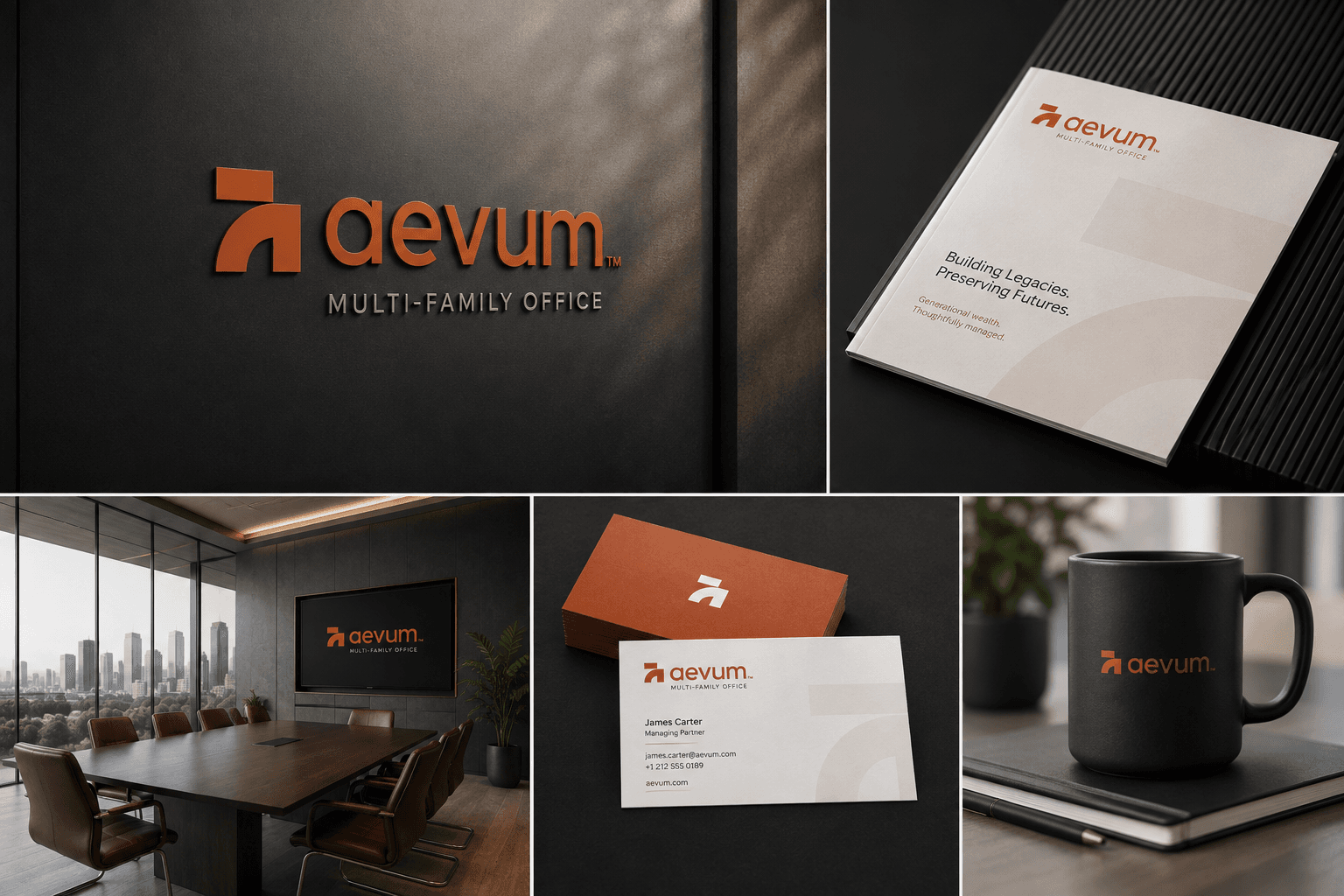
Aevum applied to office signage, a brochure, a boardroom screen, business cards and a branded mug
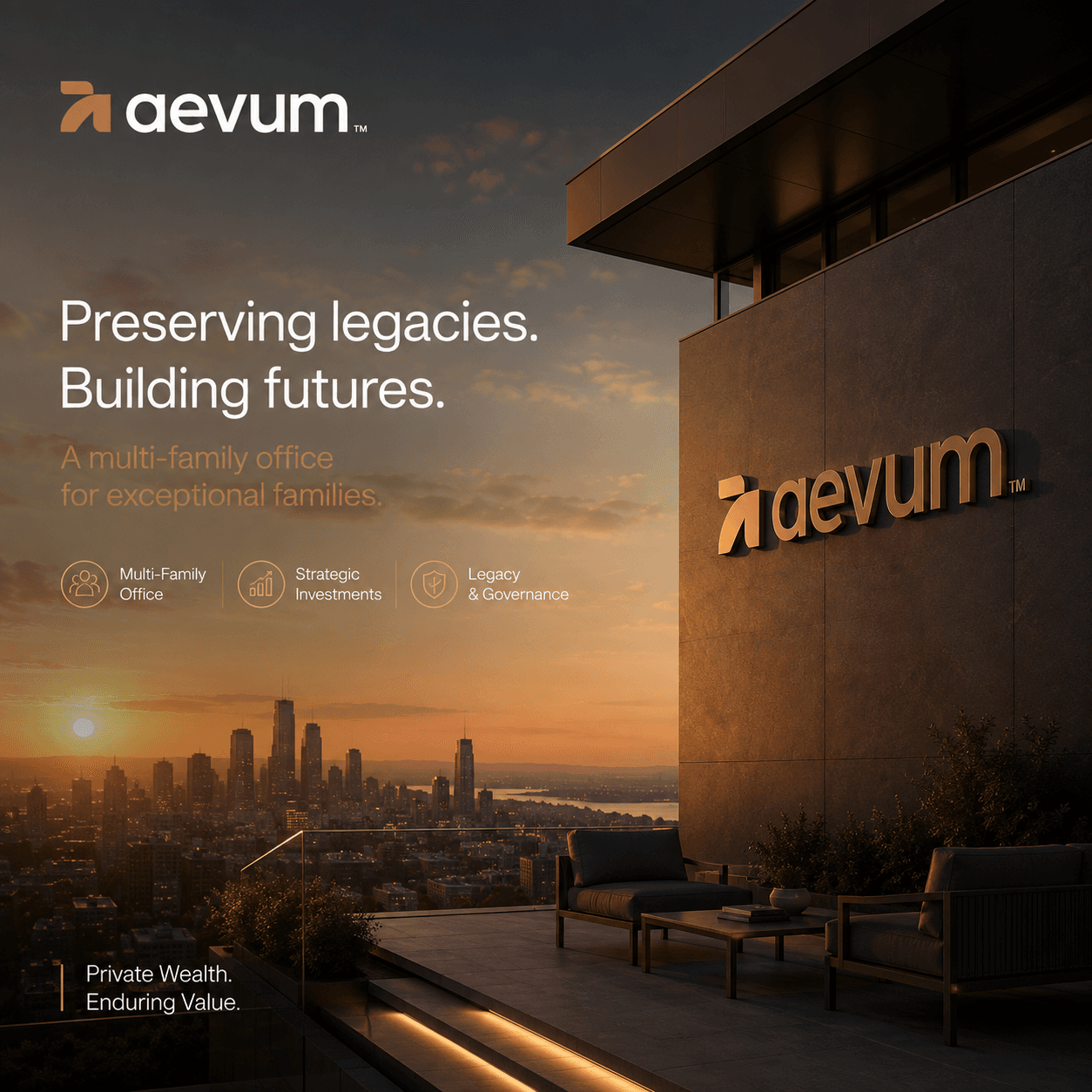
Aevum campaign post — the logotype in bronze on a terrace facade above a city at sunset, headlined “Preserving legacies. Building futures.”
The Aevum logotype in orange, centred on a light grey field
Aevum headquarters at dusk — the logotype lit on a stone wall, a “Private. Disciplined. Aligned.” banner at the entrance and detail shots of the signage and facade
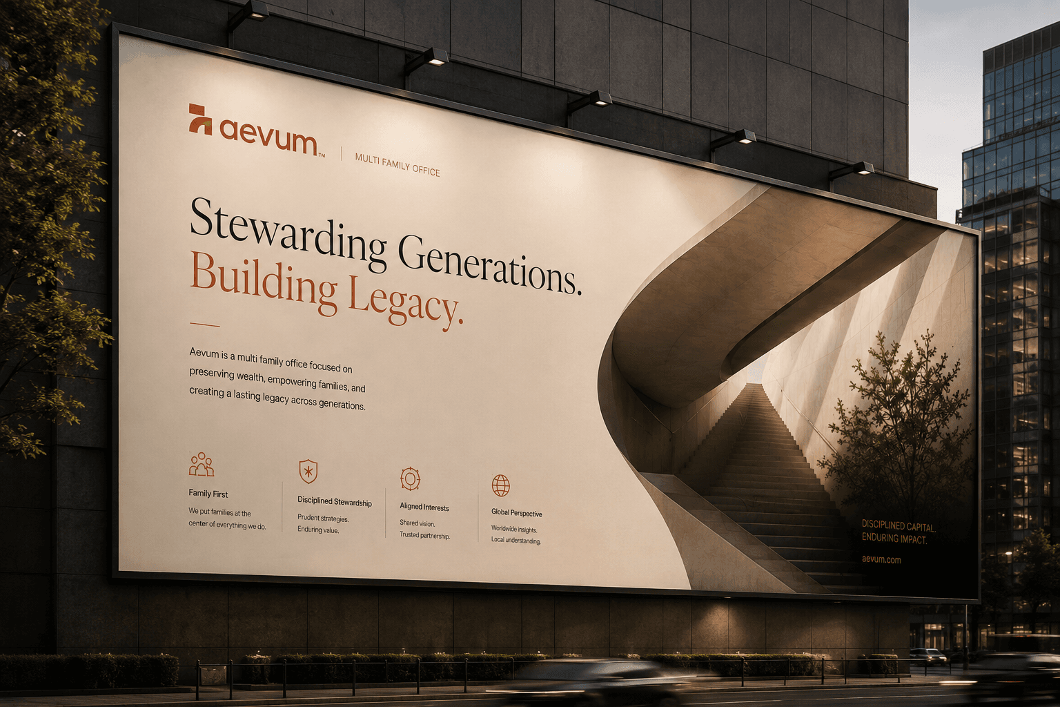
A city billboard reading “Stewarding Generations. Building Legacy.” beside a curved concrete stairwell, with the four Aevum principles along the base
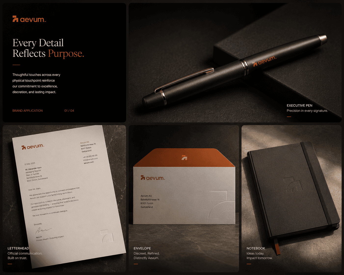
Aevum stationery board — a bronze-trimmed executive pen, letterhead, a copper-lined envelope and an embossed notebook under the line “Every Detail Reflects Purpose.”
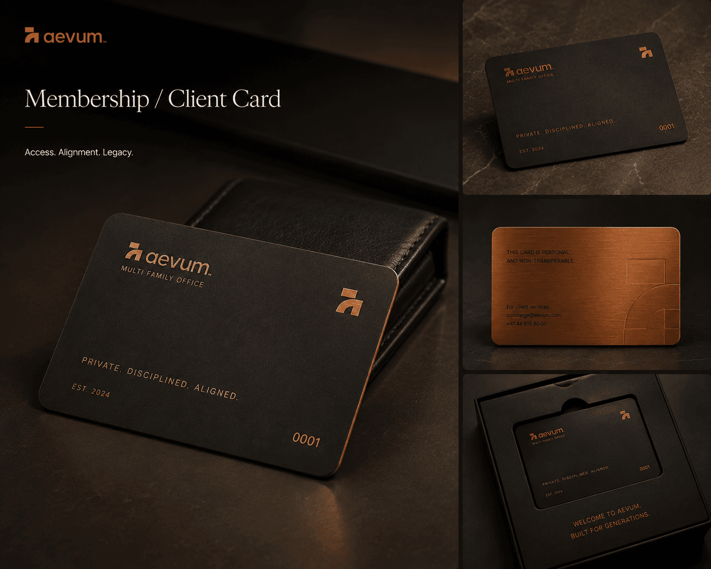
The Aevum membership card — matte black with a copper edge, numbered 0001, shown front, back and in its presentation box
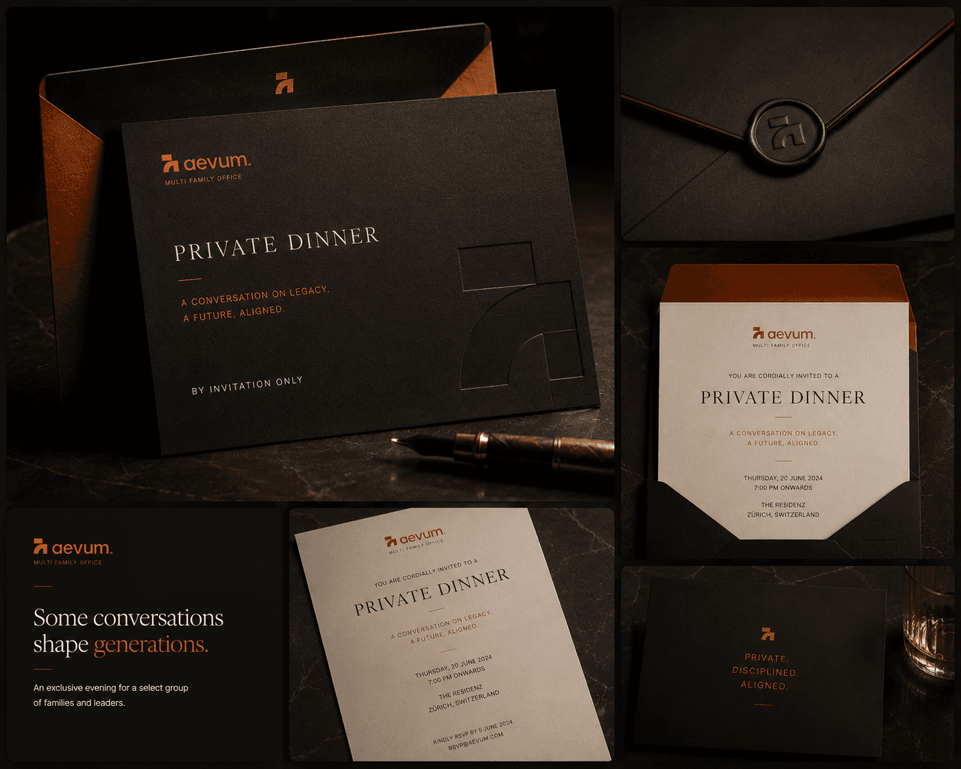
Aevum private dinner invitation suite — a debossed black card, wax-sealed envelope and copper-lined liner under the line “Some conversations shape generations.”
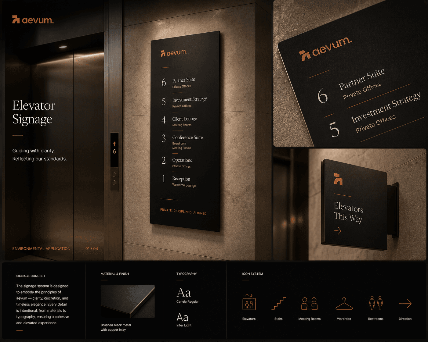
Aevum elevator signage board — a floor directory in brushed black metal with copper inlay, a projecting wayfinding blade, and the material, typography and icon system beneath
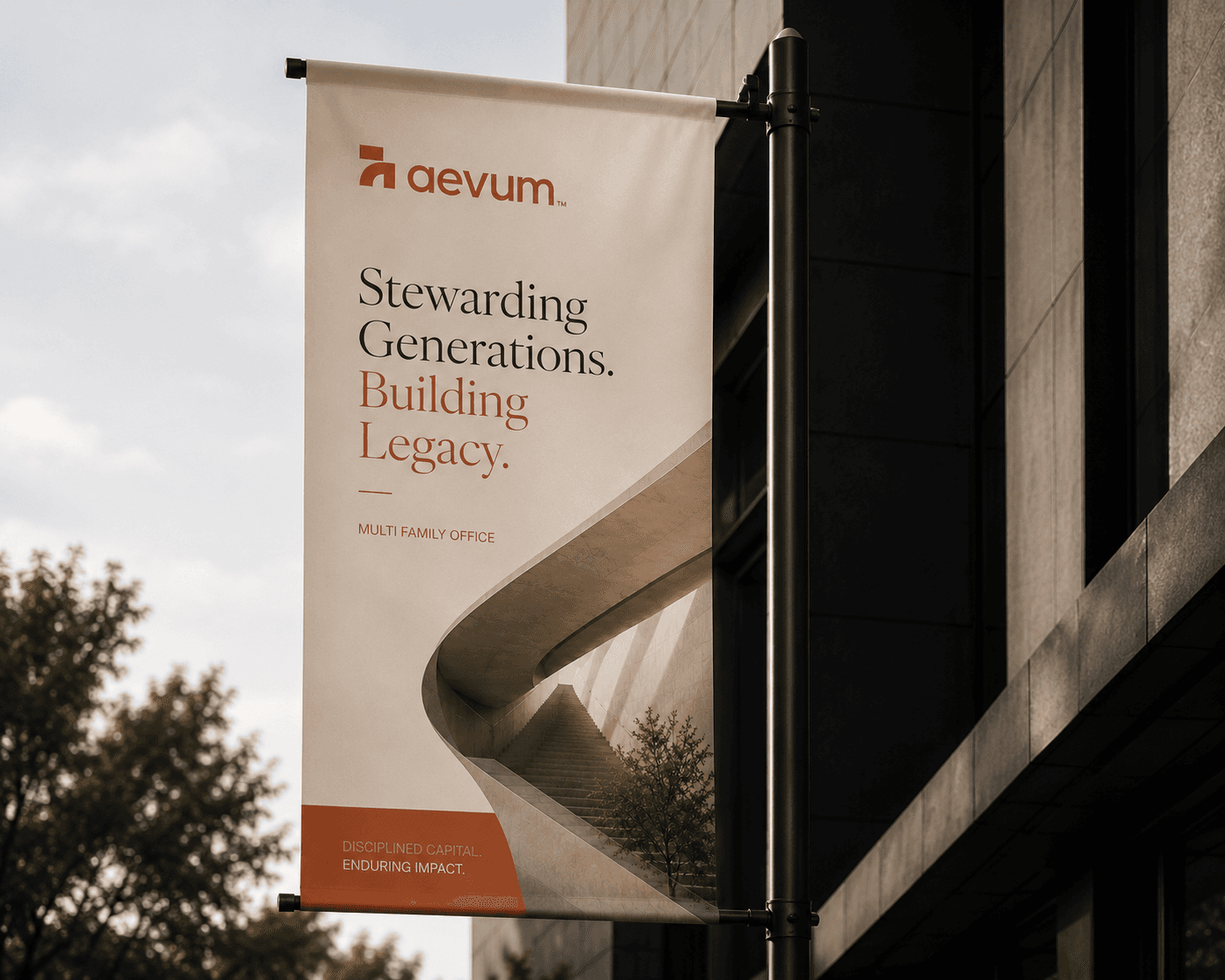
An Aevum street banner on a lamp post reading “Stewarding Generations. Building Legacy.” against a dark stone facade
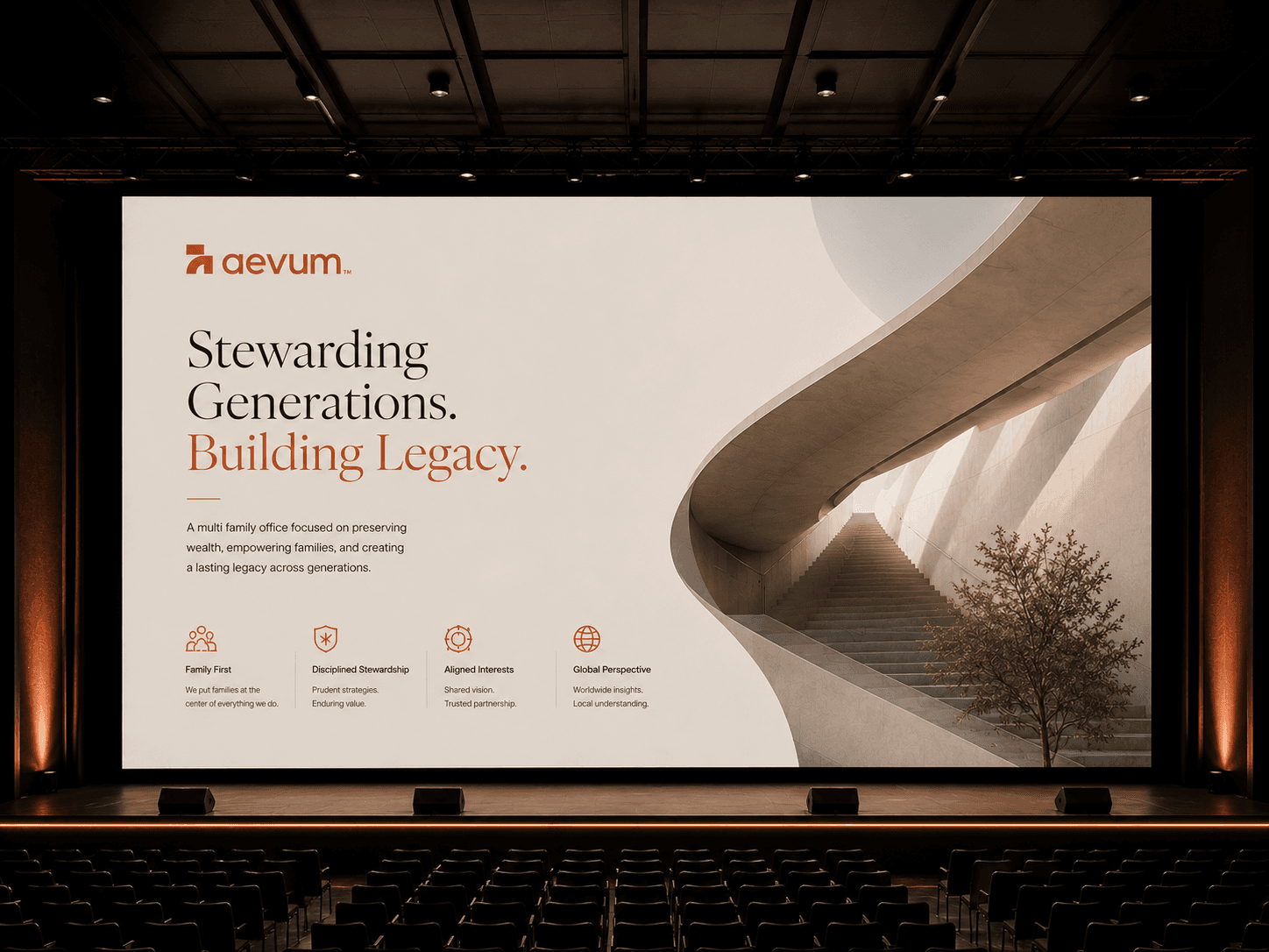
The Aevum keynote slide on an auditorium screen — the logotype, “Stewarding Generations. Building Legacy.” and the four principles beside a curved concrete stairwell

Outcome

What the system enables: a firm that can hold a room of skeptical families without raising its voice, a quarterly report clients keep on the shelf instead of in a drawer, and a visual language that still reads correctly in 2050. Every decision in the identity was tested against one question: would a family with 50 million feel more confident handing it over after seeing this?