
Asta: Rebrand and Website Revamp for an Enterprise Engineering Firm
Asta engineers enterprise software out of Colombo and Jaffna: product platforms, bespoke architecture, and the monitoring and grid integration systems renewable energy operators run on. It had the record to prove it, work in twelve countries and a national ingenuity award, and a brand still wearing the clothes it was founded in. We rebuilt the identity around the standard the engineering already holds, then rebuilt astalab.io to argue it.
Problem
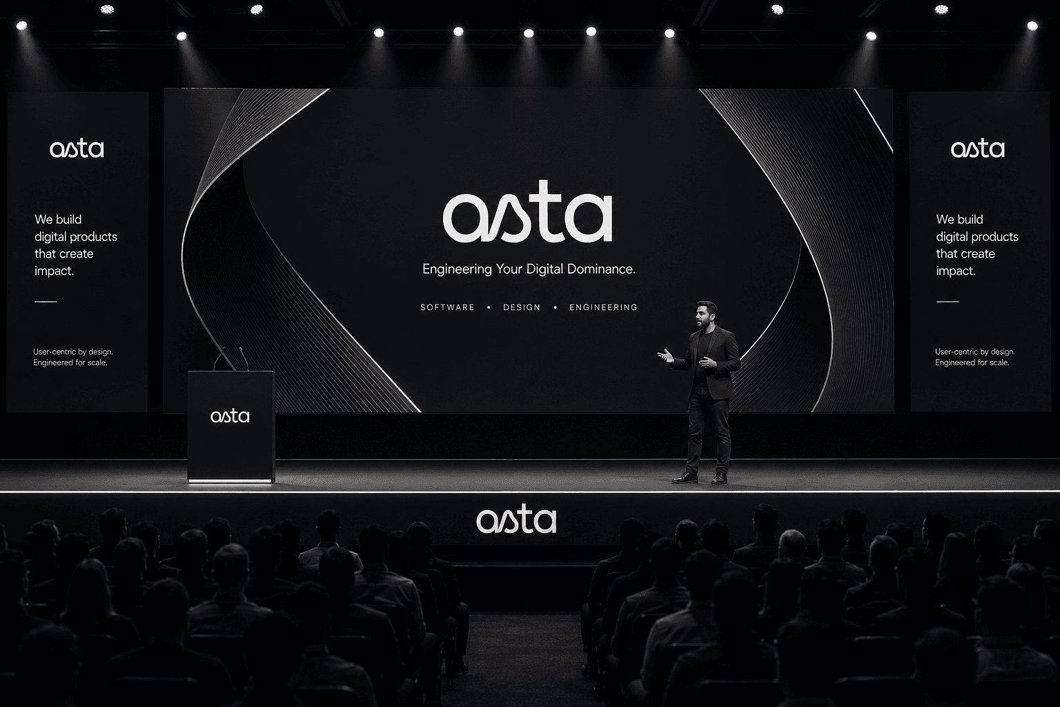
Every software firm sells the same sentence. Senior team, scalable architecture, user-centric design, delivered on time. None of it costs anything to claim and none of it can be checked from outside, so a buyer discounts all of it equally and decides on price. Asta's real argument is a standard that holds when load arrives, and nothing about the way the company looked was carrying it.


Outcome
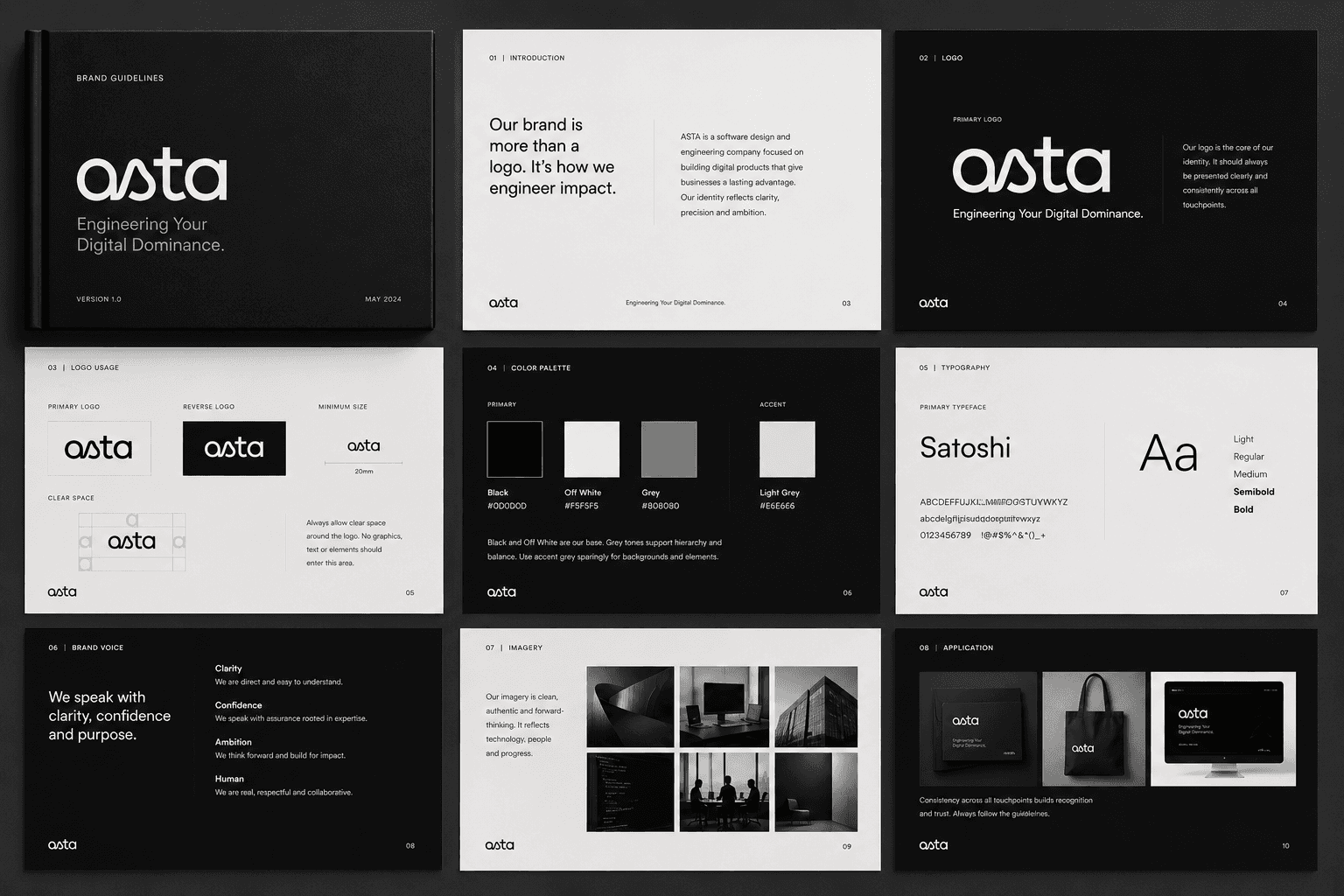
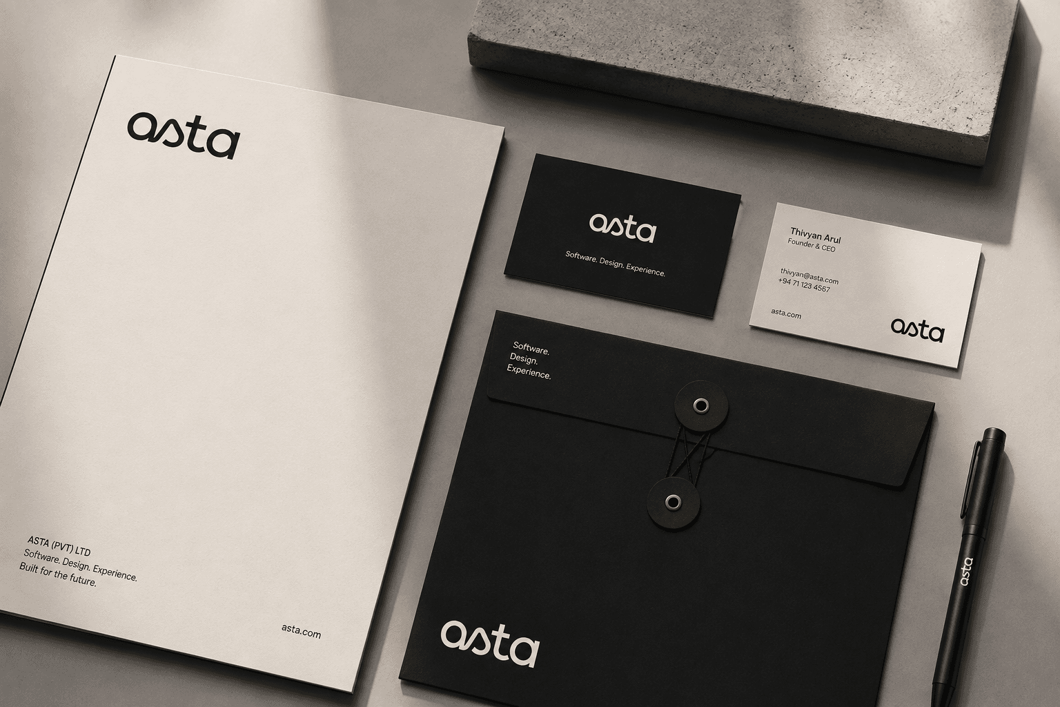
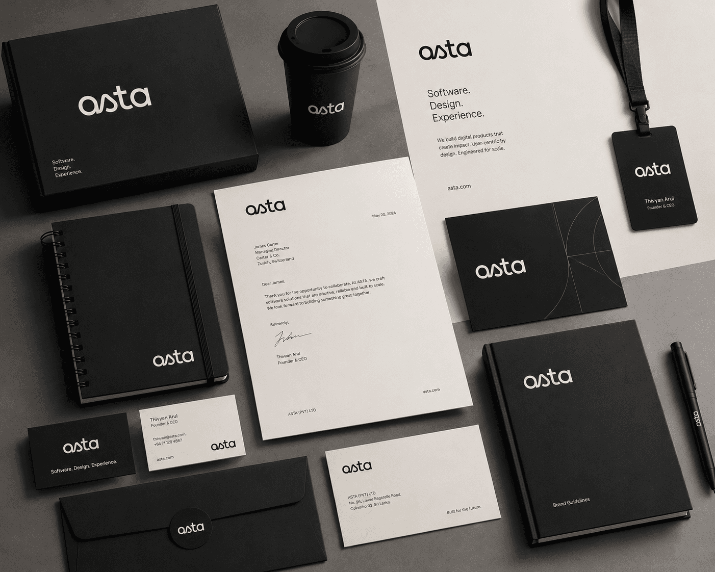
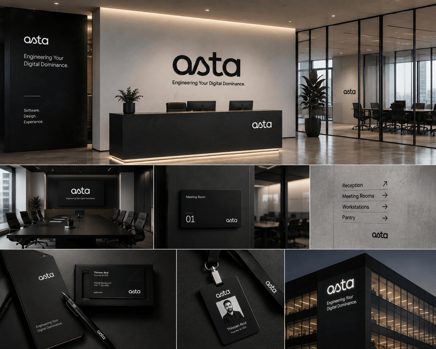
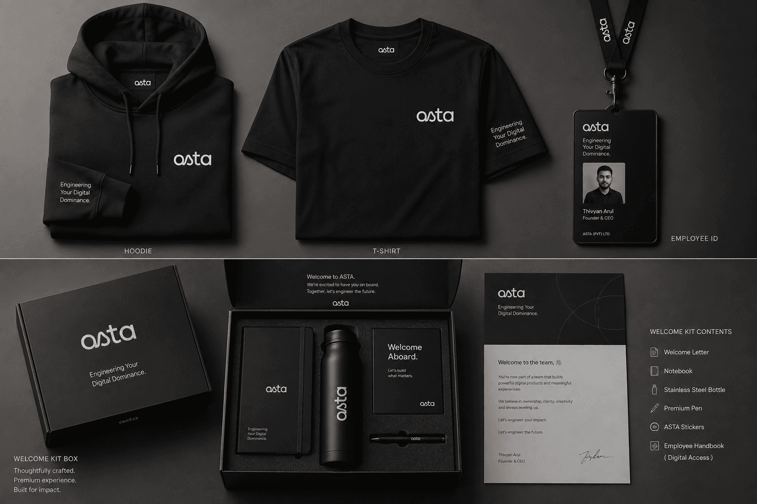
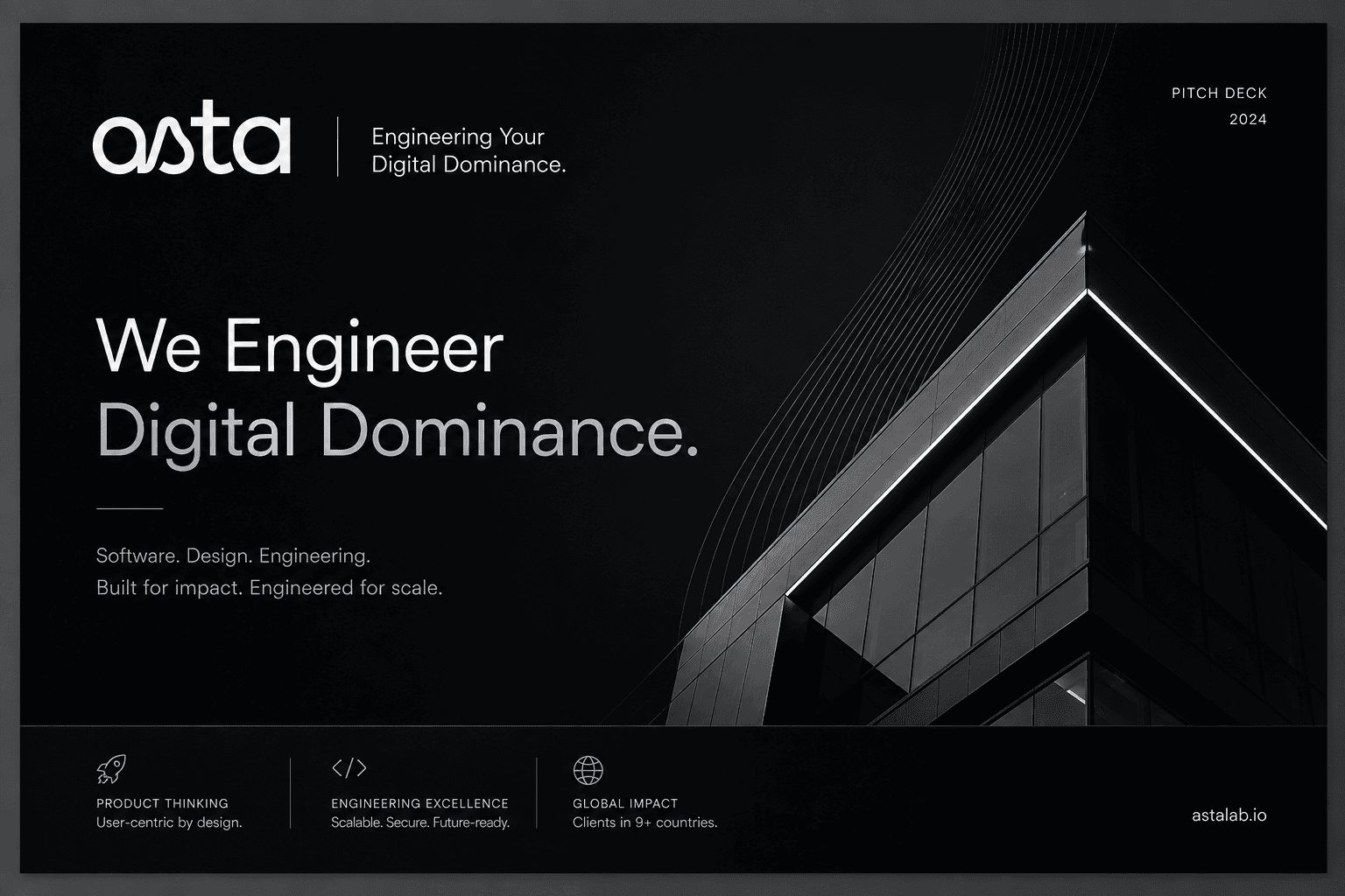
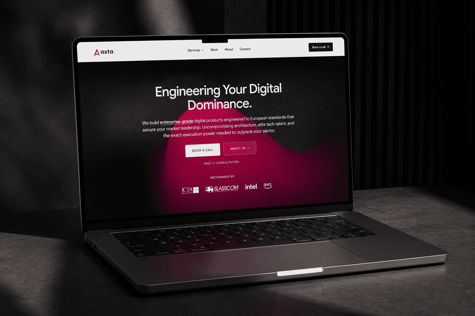
A line that states the ambition instead of the service: Engineering Your Digital Dominance. A monochrome system to carry it, black and off white with grey doing the ranking, because a firm selling infrastructure should not date the way an accent colour does. The book fixes clear space, minimum size, voice and imagery before a single application, so nineteen people in two cities apply one brand without asking. And on astalab.io the standard is the argument rather than the adjective: reliability figures published as design targets and labelled as design targets, six services named plainly, the build process laid out step by step. Asta now reads to a European enterprise buyer the way it already worked.