Aston Homes: Brand Identity for a Swiss Luxury Residential Developer
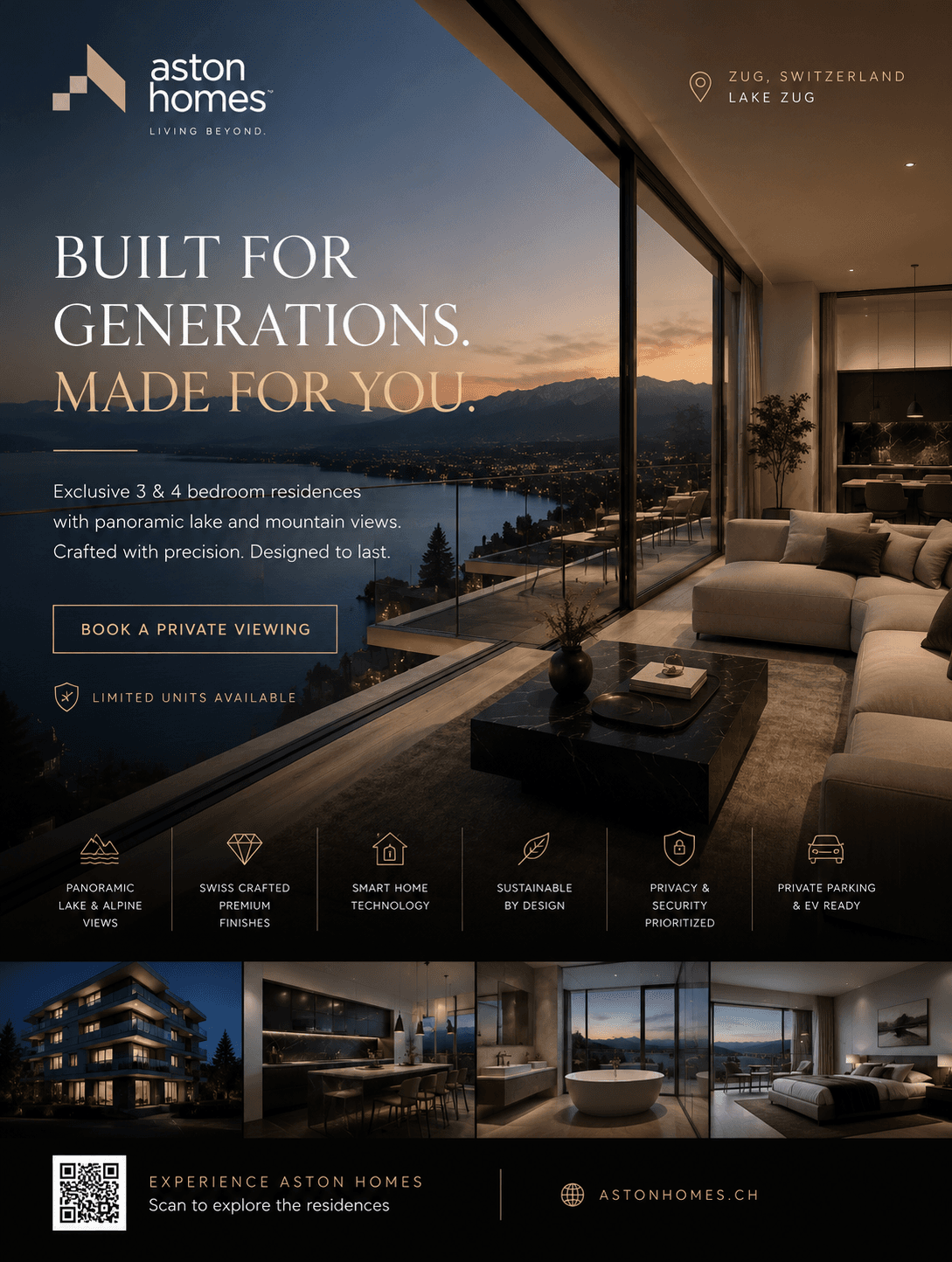
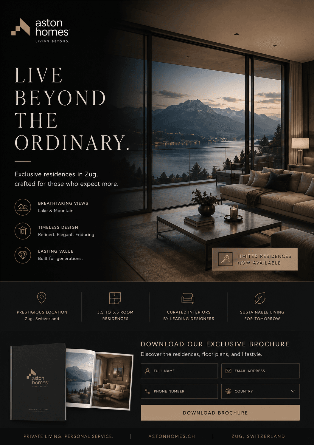
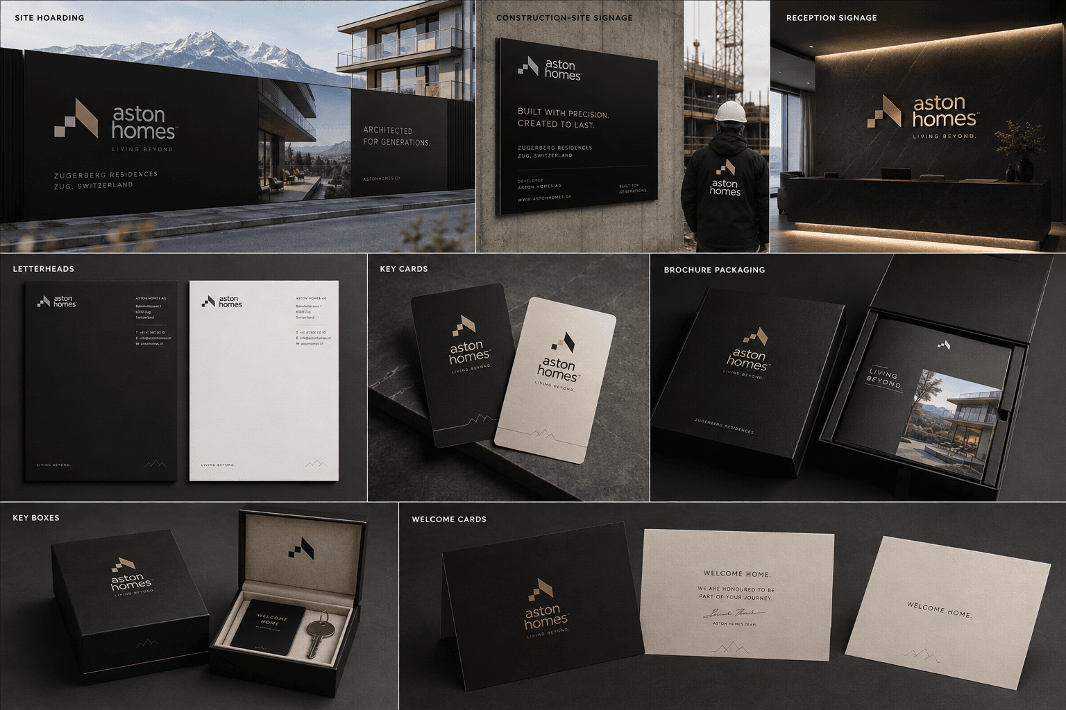
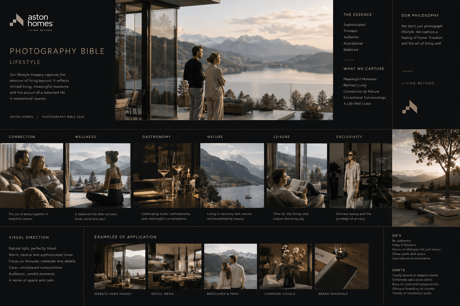
Aston Homes builds residences above Lake Zug, and like every developer it has to sell them years before there is a building to walk through. We built the brand for that whole span: an identity that has to carry a construction hoarding, a photography standard that keeps the imagery honest, and a plan sheet, key box and resident guide that take it through to the day the keys change hands.
Problem
Luxury property is sold in renders and adjectives. Every development on the lake shoots the same water at the same hour and describes itself in the same words, exclusive, timeless, crafted, so a buyer comparing two of them is left with the price and a finish schedule. The harder problem is time. For the two years before anyone can stand in a room, the hoarding on the site is the only thing the company has, and it is doing all of the selling.
Outcome
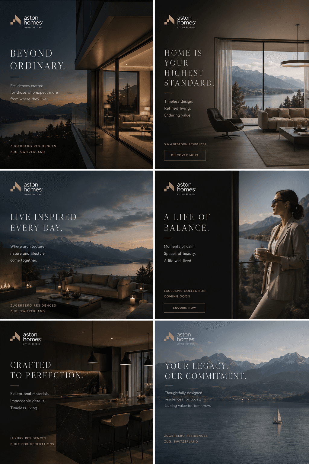
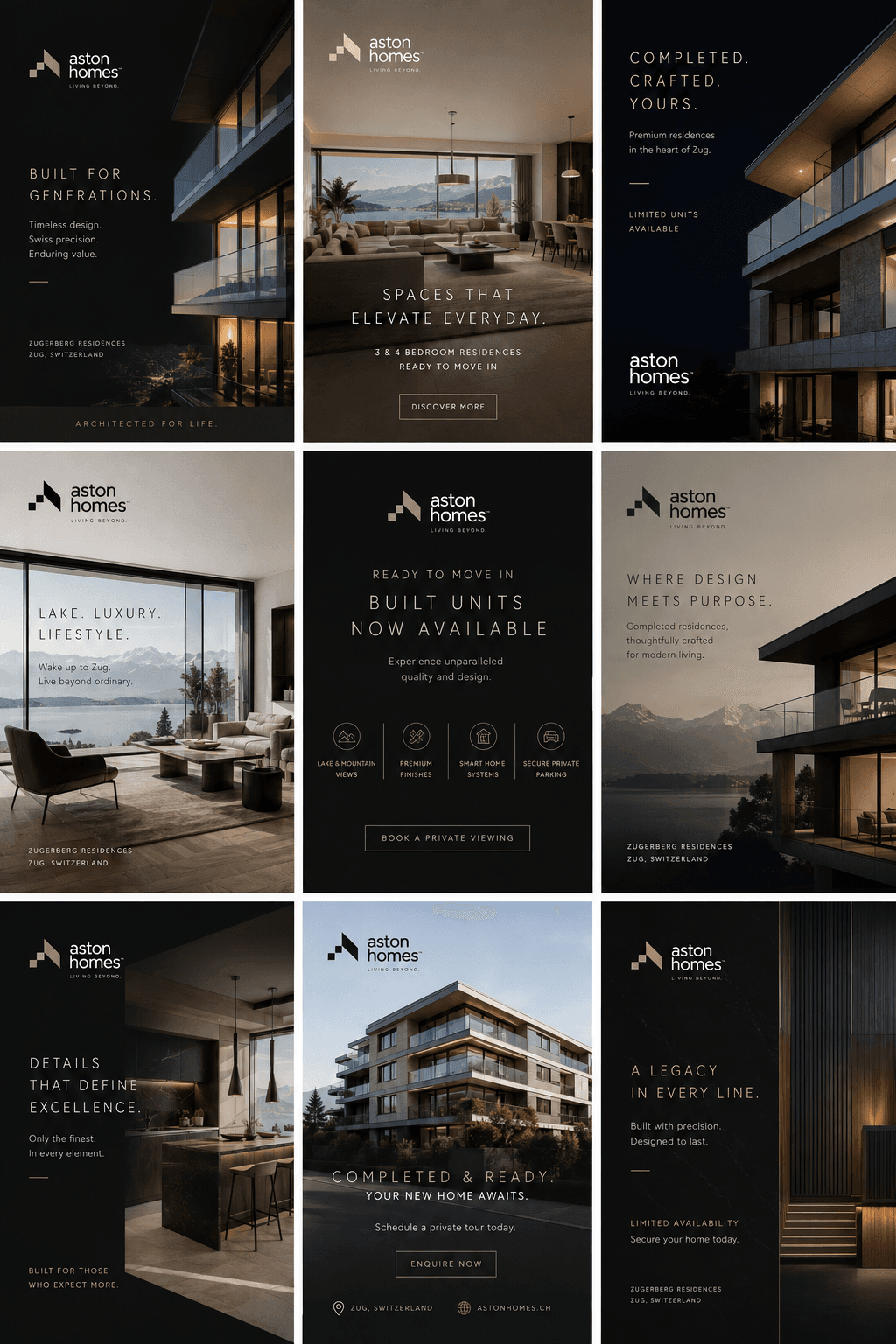
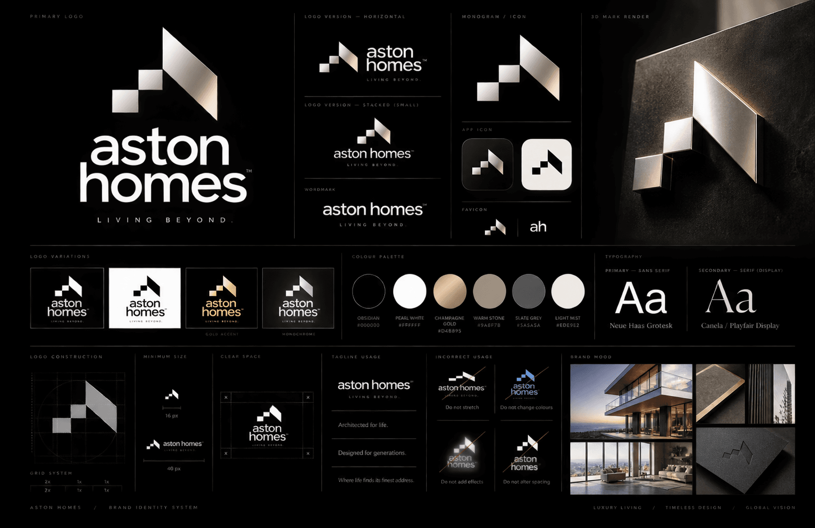
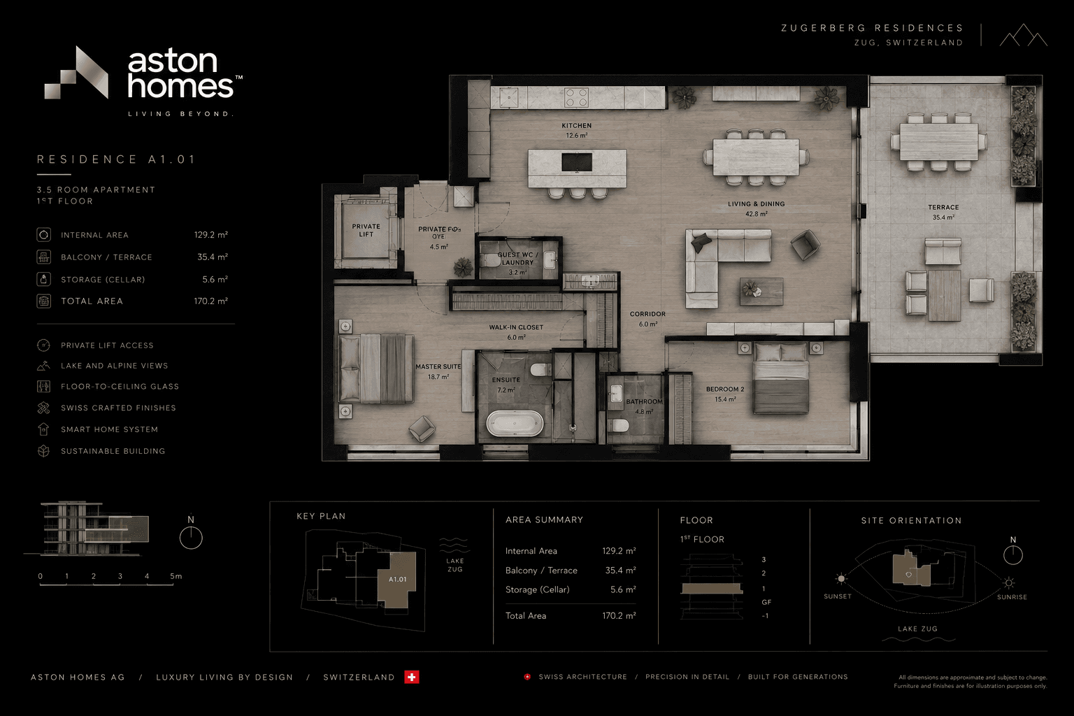
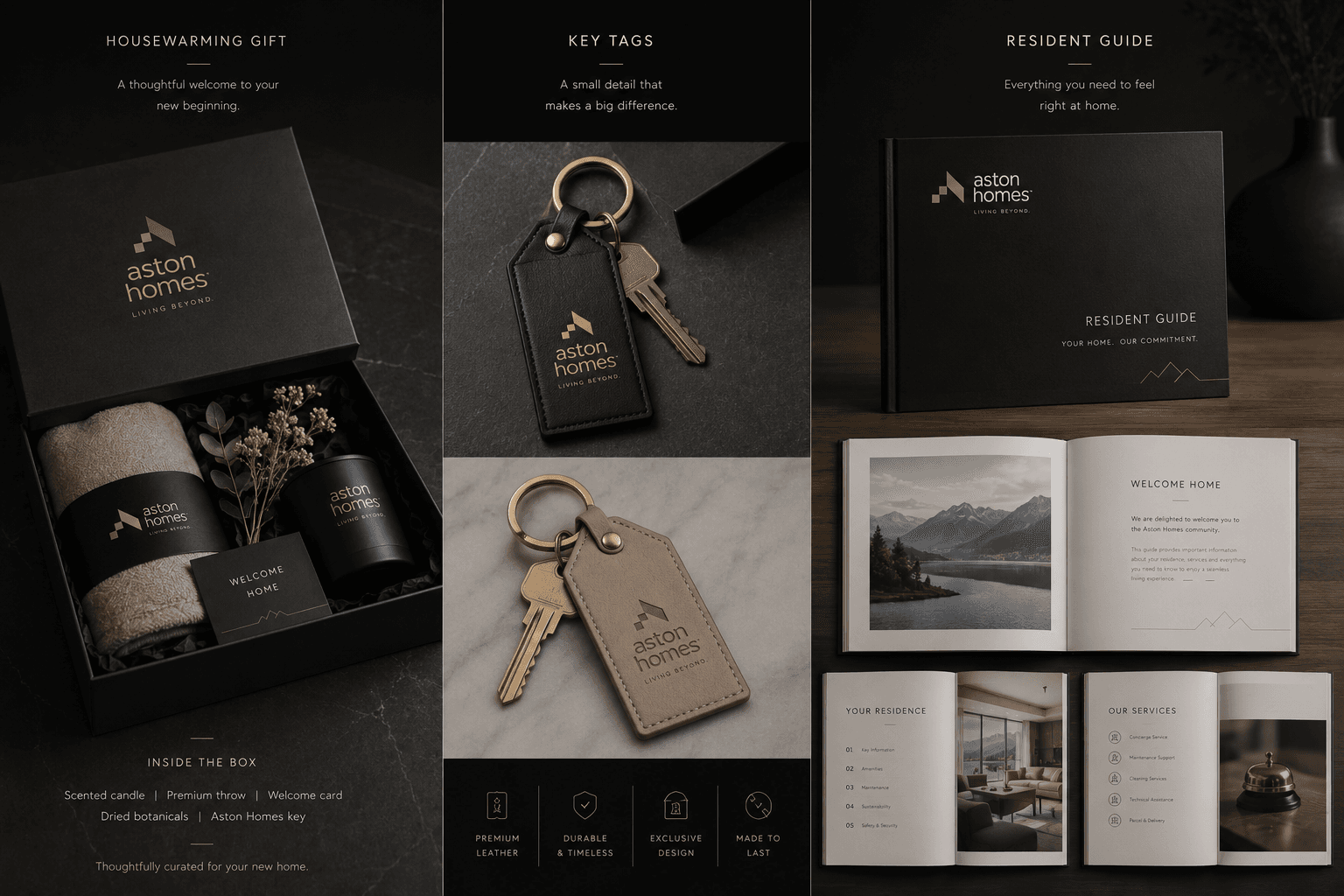
One mark that works at both ends of the cycle, cut into a hoarding at construction size and foil blocked onto a key tag. A photography bible that fixes what the camera is allowed to promise, natural light, real rooms, nobody posed, because the imagery is the product for two years and an overreaching render is a complaint waiting to be filed. The Residence Sheet publishes what a render leaves out, internal area, balcony, storage, floor, orientation and where the sun lands, so a buyer can compare Aston Homes to the development next door on numbers rather than adjectives. And the handover collection makes the closing day the first day of the brand rather than the last: a key box, a leather tag and a resident guide, handed over in person.