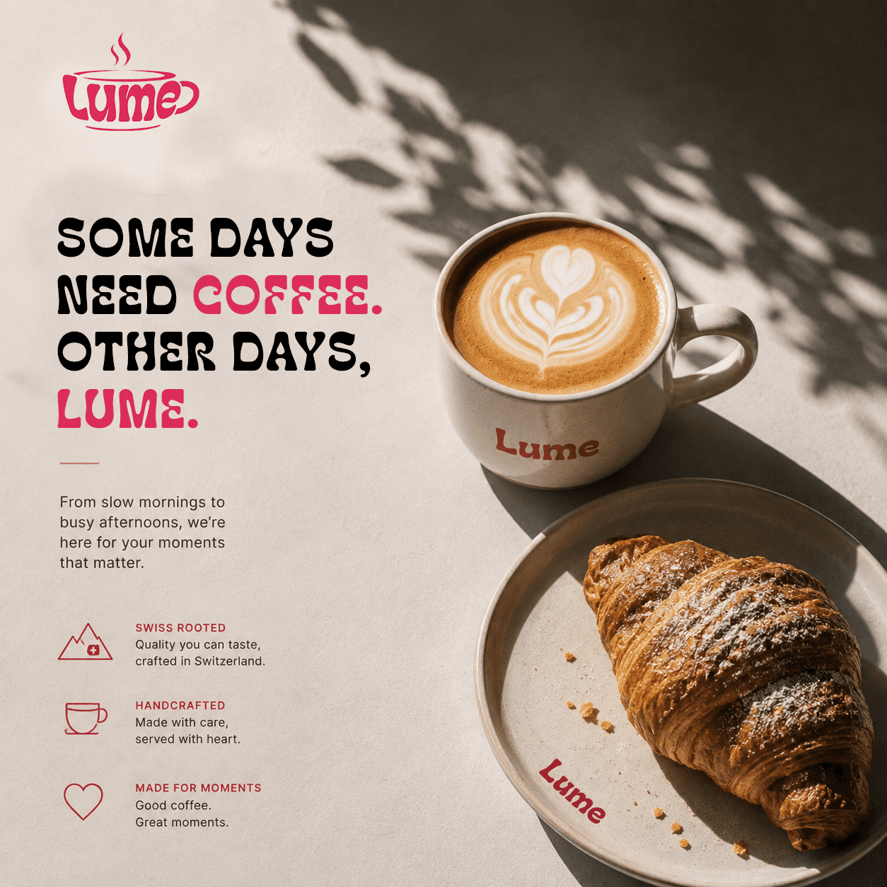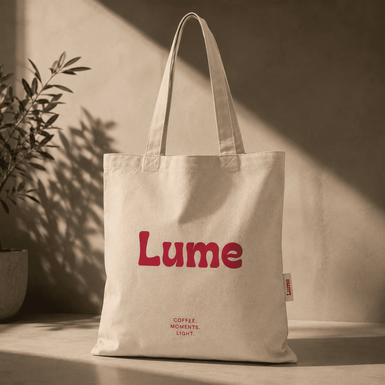
Lume — Branding for a light-roast-only specialty roastery
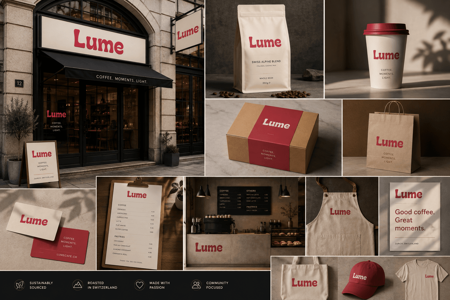
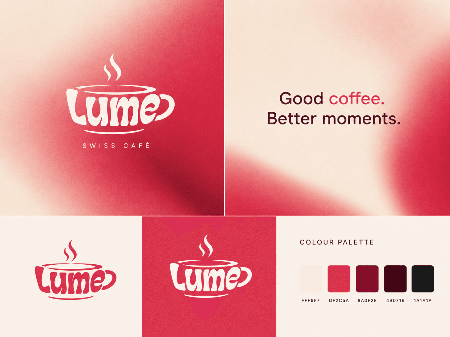
Lume is a specialty roastery that roasts light only. We built the brand around that constraint: a positioning that moves the argument off taste and onto sourcing discipline, a seasonal identity system that runs across retail and wholesale packaging, and an annual report that puts the buying record in public.
Problem
Specialty coffee has a credibility problem it never has to answer for. Every roaster claims direct trade, good relationships and careful sourcing, and every roaster wins that argument inside its own copy. Nobody can check it.
Outcome
A positioning line that does the work before anyone tastes anything: the roast that hides nothing can only be sold by a roaster who sources like it. One device and one seasonal colour logic that stretch from a 250g retail bag to a 1kg wholesale sack without redrawing the system. The Lume Harvest Report, an annual publication with one spread per origin: producer, altitude, varietal, harvest window, volume bought, and price paid against the C-market that season. It makes Lume the roaster whose books are open, which is the only defensible authority position left in specialty coffee.